
What’s newCard-testing protection now guards every store, Free included. See checkout

Admin panels › Product details

Design

The badge on a product’s card and how its picture reacts to the pointer in your store’s lists. 3 parts.

Quick links

Where to find it:WP Admin › EasyCart › Products › open a product › Design

On the card

Badge and effects

What the product’s card says, and how its picture moves.

Badge

A tag on the product’s card in your store’s lists

no stored settings

Design holds the badge on a product’s card and the way its picture reacts to the pointer. It starts folded, since most products never need it; folded, it says what is set, such as Badge: Sale · Lighten.

Badge picks the tag’s shape: Round Tag, Square Tag, Diagonal Tag or Classy Tag, or No Tag. Badge text is what it says, such as Sale or New. Badge color fills the tag and Badge text color colors its words, each from the swatch or as a hex code; the Classy Tag uses the text color only. The badge shows on the product’s card in your store’s product lists, and on its card where another product page features it.

Badges work by being rare. A store where every product carries one has taught shoppers to ignore them, which wastes the tag on the products that really are new or reduced.
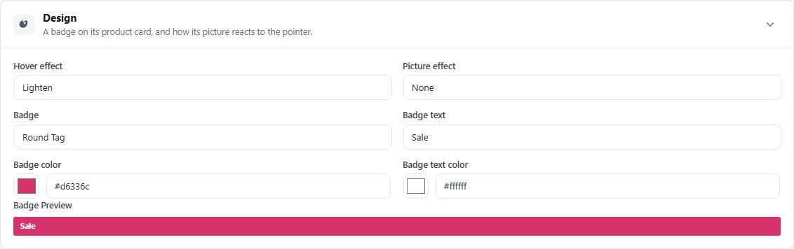
The Design section with a Round Tag reading Sale, and its Badge Preview.

💡 Note: Offers built in Offers can show their own badge on product images. Check what is already showing before adding a second one here.

Hover and picture effects

How the picture behaves in lists

no stored settings

Hover effect sets what happens when a shopper points at the product’s picture in a list: Image Flip, Image Crossfade, Lighten, Image Grow, Image Shrink, Grey Color, Brighten, Image Slide, Flipbook or No Effect. Image Flip, Image Crossfade, Image Slide and Flipbook use the product’s other pictures from Media.

Picture effect adds a Border or a Shadow around the picture, or None.

💡 Note: How product cards are laid out across the store, such as image height and a border around each product, is set under Settings › Appearance › Design.

Before you save

Previews

Seeing the badge as shoppers will.

Seeing it before you save

Badge Preview and the Storefront card

no stored settings

Badge Preview, under the fields, shows the tag with its text and colors as you type; it appears once a badge has text. The Storefront card in the Summary column shows the product’s card with the badge on its picture, also before you save. Like every section, Design waits for Save, and Discard puts it back.
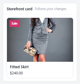
The Storefront card in the Summary column, showing a Sale badge before it is saved.

Keep going

Related panels

The Product Editor

The whole editor: views, the Summary column and saving.

Media

The pictures the hover effects use.

Offers

Offers, which can add their own badges.

Design

Product card layout for the whole store.

Storefront

Where the product shows in your store.

Basics

The product title and descriptions.

Ready to run your store on WP EasyCart?

Everything in this guide works with the free plugin. PRO and Premium add subscriptions, memberships, wholesale pricing and more. Try every PRO feature free for 14 days.
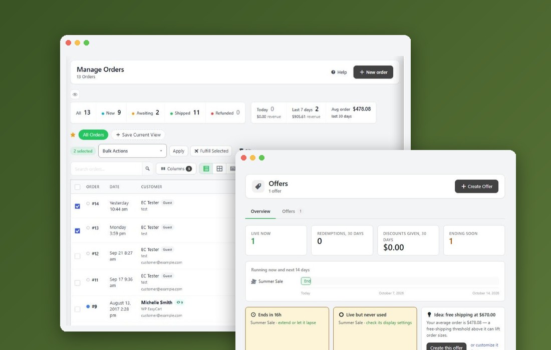
The WP EasyCart admin: orders and offers
Updated on October 12, 2026