
Navigation

Admin panels › Reports

Reports & Store Stats

The first screen in EasyCart, and the one that answers how the store is doing. Pick a range, pick something to compare it against, and read the result. 5 parts.

Range and comparisonEleven headline figuresThree CSV exports

Before you start

Where it lives, and how the panel works

From your WordPress dashboard open EasyCart › Reports.

WP Admin EasyCart Reports

Search instead of hunting

The search box at the top of the page filters it as you type, and it matches hidden keywords as well as names. The same box on the Settings home searches every panel at once.

Jump between sections

A section list sits beside the page and follows you down it, so you can move straight to the part you came for without scrolling through everything between.

Advanced settings are folded away

Each section hides its rarely-changed settings behind a Show N advanced settings link, naming the first few so you know whether it is worth opening. 0 of the 0 settings on this page start folded.

Dependent settings appear as needed

Settings shown indented here only exist once the setting above them is switched on. Choosing a comparison period adds a second series to the chart and a change figure against each headline number.

Saving

Switches and dropdowns save the moment you change them. Anything you type collects in a save bar at the foot of the page that counts your unsaved changes and warns you before you navigate away.

Locked settings

Rows marked with a padlock need WP EasyCart PRO or Premium. They stay visible so you can see what the upgrade adds. Nothing on this page is locked.

On default is enabledOff default is disabledValue factory defaultPRO needs PRO or PremiumAdvanced behind the fold

Reading the store

Range, figures and chart

Choosing the period, understanding what each number counts, and reading the trend.

Date range and comparison

The period every number and chart on the page is built from

no stored settings

Everything on this screen answers to the date range, so it is the first thing to set. The presets cover the ranges people actually ask for: today, yesterday, the last seven or fourteen or thirty days, this or last month, this or last quarter, this or last year, and longer spans out to the last five years. Any custom range can be typed instead.

The comparison is what turns a number into information. Comparing to the previous period tells you whether this month beat last month; comparing to the same period in the previous year strips out seasonality, which for most stores is the more honest question. There are dedicated presets for the last seven days and last three months against the previous year for exactly that reason.

The comparison drives both the change shown against each headline figure and the second series drawn on the chart.
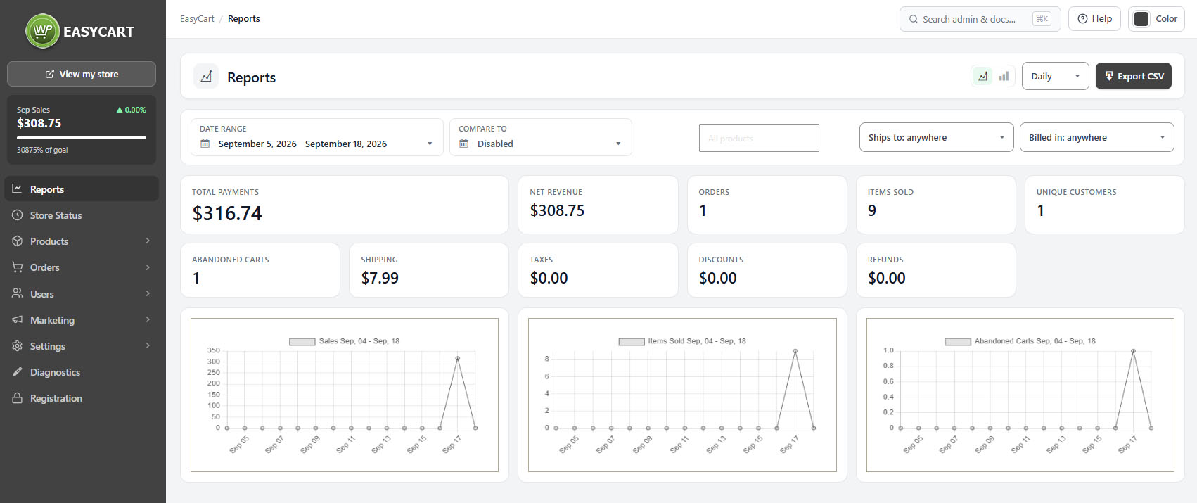
Reports, showing the date range and comparison controls above the headline figures.

The headline figures

What each number counts, and which ones are easy to misread

no stored settings

Orders and Items sold are the volume pair: how many orders were placed, and how many individual items went out inside them. The ratio between them is your basket size, and a change in it usually says more than either number alone.

Net revenue is the figure to watch. Total payments is what was actually charged, which includes shipping and tax, so it is always the larger number and is not what you earned. Refunds, Discounts, Shipping, Taxes and Fee break out the parts that separate the two, so you can see whether a soft month was weak sales, heavy discounting, or refunds.

Unique customers counts people rather than orders, which is how you tell growth from repeat buying. Abandoned carts counts what did not convert, and is the one figure on the page you want falling.

💡 Note: Total payments and net revenue are not the same thing and the gap between them is shipping, tax and fees. If you are judging performance, read net revenue; if you are reconciling against your payment provider, read total payments.

The chart

Three series, drawn as lines or bars, grouped by day, week, month or year

no stored settings

The chart plots the selected range with the comparison period behind it, so the shape of the two is directly readable rather than something you calculate in your head.

Switch between a line and bars depending on what you are looking at. Lines suit a trend over a long span; bars suit comparing discrete periods, such as month against month.

The grouping, daily, weekly, monthly or yearly, decides how the data is bucketed. Match it to the range: daily buckets across two years is noise, and yearly buckets across one month is a single column. If the chart looks uninformative, the grouping is usually the reason rather than the data.

Narrowing and taking it away

Filters and exports

Restricting the page to one product or country, and getting the data out as CSV.

Filters

Narrowing the whole page to one product or one country

no stored settings

Three filters narrow everything at once, the figures and the chart together.

Product restricts the page to a single product, which is how you answer whether a particular line is carrying the store or quietly dying.

Ships to and Billed in restrict by country, and they are deliberately separate because they answer different questions. Ships-to is about logistics and demand by market. Billed-in follows the payment address, which is the one that matters for tax. They diverge more often than you would expect, particularly on gift orders and business purchases.

💡 Note: Ships-to and billed-in are different countries on a surprising number of orders. Use billed-in for anything tax-related and ships-to for anything logistics-related.

Exports

Three CSV files, each answering a different question

no stored settings

The main report exports the selected range as a CSV, honouring whatever filters are set, so what you download is what you are looking at.

The compare range report exports the comparison period instead, which saves running the export twice and lining the two up by hand in a spreadsheet.

The tax report is the one your accountant wants. It breaks the period down for filing rather than for analysis, and it is worth pairing with the billed-in country filter when you file in more than one jurisdiction.

💡 Note: Exports respect the filters and range currently on screen. Set the page up so it shows what you want before you download, rather than filtering afterwards in a spreadsheet.

Keep going

Related panels

Order Management

The orders behind these figures, individually.

Abandoned Carts

The abandoned carts counted here, and how to recover them.

Inventory Report

Stock levels, the other operational view of the catalogue.

Products

The products a single-product filter narrows to.

Offers

Discounts and promotions, which show in the discount figure.

Taxes

Tax setup, behind the tax figure and the tax report.

Try the PRO features free for 14 days

Anything marked PRO comes with WP EasyCart PRO or Premium. Take the whole thing for a run on your own store before you decide.

Updated on September 18, 2026