
Detailed Settings
Design Settings
Designing in EasyCart is meant to be simple and intuitive. Out of the box, your store adapts to fit your existing theme — and this panel takes it a step further, letting you dial in colors, fonts, layouts, and templates until EasyCart looks like it was born in your WordPress theme.
Watch the Walkthrough
Prefer to watch? See fonts, colors, custom CSS, columns, and design templates in action.
Basic Customization with EasyCart
Learn to add basic customization such as font changes, color changes, and custom CSS, plus column and design template choices in this demonstration.
Core Design Settings
The essentials that shape how EasyCart looks and behaves inside your theme.
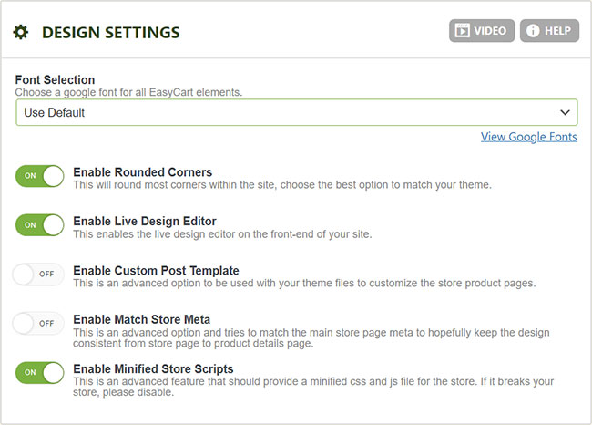
- Font Selection: Choose from a wide variety of Google Fonts to match your site’s look. These apply to EasyCart pages.
- Display Rounded Corners: Round the corners on buttons and text items — or disable for a squarer appearance.
- Enable Live Design Editor: The ‘white gear’ editor on your store’s front end lets you adjust columns, colors, and other basics live while viewing your pages (just be logged into WordPress). If you hit a theme conflict, turn it off here.
- Enable Custom Post Template: Many themes offer a custom post template that changes the layout of product and product details pages. Enable it here — but confirm your theme supports the feature.
- Enable Match Store Meta: Makes product details pages (custom posts) match the meta of your store page (a WordPress page) so both look consistent.
- Enable Minified Store Scripts: Loads minified versions of the store’s CSS and JS files. Recommended for better load times and speed scores.
WP EasyCart — Design Settings
Store Colors
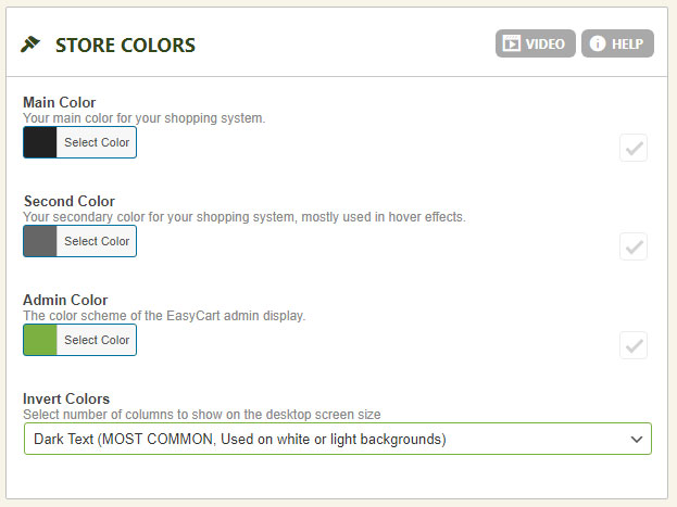
Match EasyCart to your brand in four picks.
- Main Color: The primary color EasyCart uses throughout your store.
- Second Color: The secondary accent color.
- Admin Color: Sets the color of the WordPress admin area — also switchable from the top right corner while working in the administrative tool.
- Invert Colors: Flips most text color from dark to light in one click. Dark background website? EasyCart turns text white. Light background? Text goes dark.
WP EasyCart — Store Colors
Custom CSS That Survives Updates
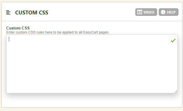
Add custom CSS to the EasyCart system here and it’s retained even after plugin upgrades. This is the preferred home for custom EasyCart CSS — write it once, keep it forever, and never worry about losing work to an update.
WP EasyCart — Custom CSS
Cart & Checkout Layout
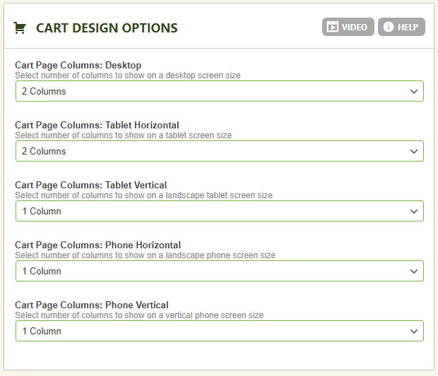
Display the shopping cart and checkout in a 2-column or 1-column layout — and choose per device (desktop, tablet, phone). Theme has a sidebar eating your content space? Switch to 1 column and reclaim the room.
WP EasyCart — Cart Design Options
Product Details Layout
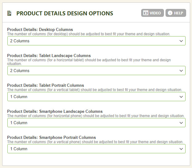
Product details pages get the same treatment: 2-column or 1-column, per device, so your product pages always fit the space your theme provides.
WP EasyCart — Product Details Design Options
Product Grid Design
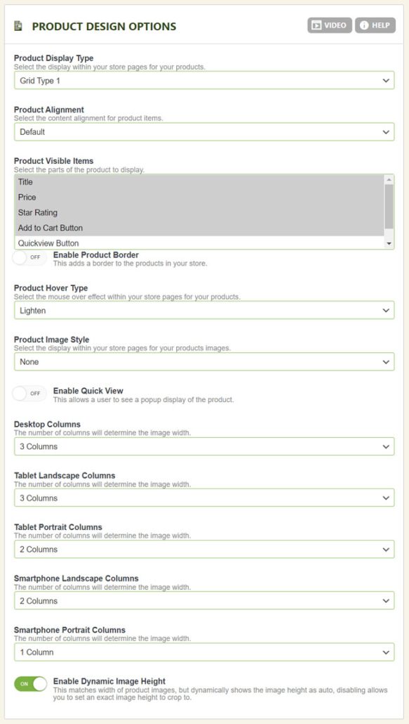
Choose from pre-built templates for your store’s product grid, then fine-tune every element.
- Product Display Type: Pick from several pre-built display designs — and tweak any of them with custom CSS if you choose.
- Product Alignment: Use each design’s default, or force content left, center, or right.
- Product Visible Items: Include or exclude the title, price, star rating, add-to-cart button, quick view button, and short description (control-click or command-click to select multiples).
- Enable Product Border: Show or hide the border on the product list display.
- Product Hover Type: Choose the hover effect on product images. Some effects cross-fade between 2 uploaded images; others grow, shrink, lighten, or darken a single image.
- Product Image Style: Adds a border or shadow to the entire product on hover.
- Enable Quick View: Shows a quick view button on hover that opens a small product dialog — no trip to the details page required.
- Columns: Set 1 to 5 columns per device, with different image heights per device to match your theme’s content area.
- Use Dynamic Image Heights (recommended): Image sections adjust to each uploaded image, with titles and pricing flowing naturally. Vastly different image heights can stagger the grid — which is why it’s optional.
- Image Height (pixels): With dynamic heights off, set a fixed image height for a consistent, even grid.
💡 Pro tip: Pre-process your images to a uniform size before uploading. Whether you pick 1000×1000 or 800×900 pixels, cropping every image to the same proportions in a photo editor gives you a consistent product grid and a polished details-page display.
WP EasyCart — Product Design Settings
Developer Feature
Advanced Design Template System
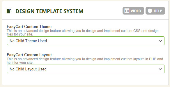
For maximum design flexibility, web designers can customize layout files directly using a child system similar to WordPress child themes. EasyCart child themes and child layouts let you override specific files — a custom email receipt is the classic example — while the rest of the store keeps receiving the latest features with every one-click update. Your custom work lives safely in its own folder; the plugin updates around it.
How the Store Finds a File
Every file loaded from the design folder goes through this check:
- Does the file exist in wp-easycart-data/design/layout/{your child layout}/file.php? Use it.
- If not, fall back to the latest file in wp-easycart/design/layout/base-responsive-v3/file.php
The theme folder works exactly the same way — also handy for specifying a custom image-not-found file.
Set Up a Child Design
- Add a new folder in wp-easycart-data/design/layout/ (something like my-custom-layout), and repeat for wp-easycart-data/design/theme/
- Go to WP EasyCart › Settings › Design and select your custom theme and/or layout folders in the dropdowns
- To override a file, copy it into your custom folder first, then make your edits there (custom changes belong in the wp-easycart-data folder)
WP EasyCart — Design Template Selection
Make It Yours
From a quick color swap to a fully customized child layout, EasyCart design scales with your ambition. Need a hand along the way? We’ve got you.