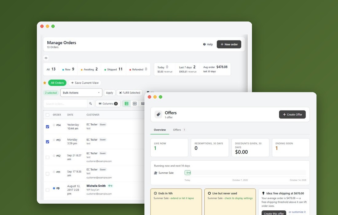
How the one-page checkout works
What you need and what shoppers get
What you need. WP EasyCart PRO or Premium with an active license. The one-page checkout is a PRO setting: the free plugin shows it locked and keeps the classic checkout, which takes shoppers through its steps one page at a time.
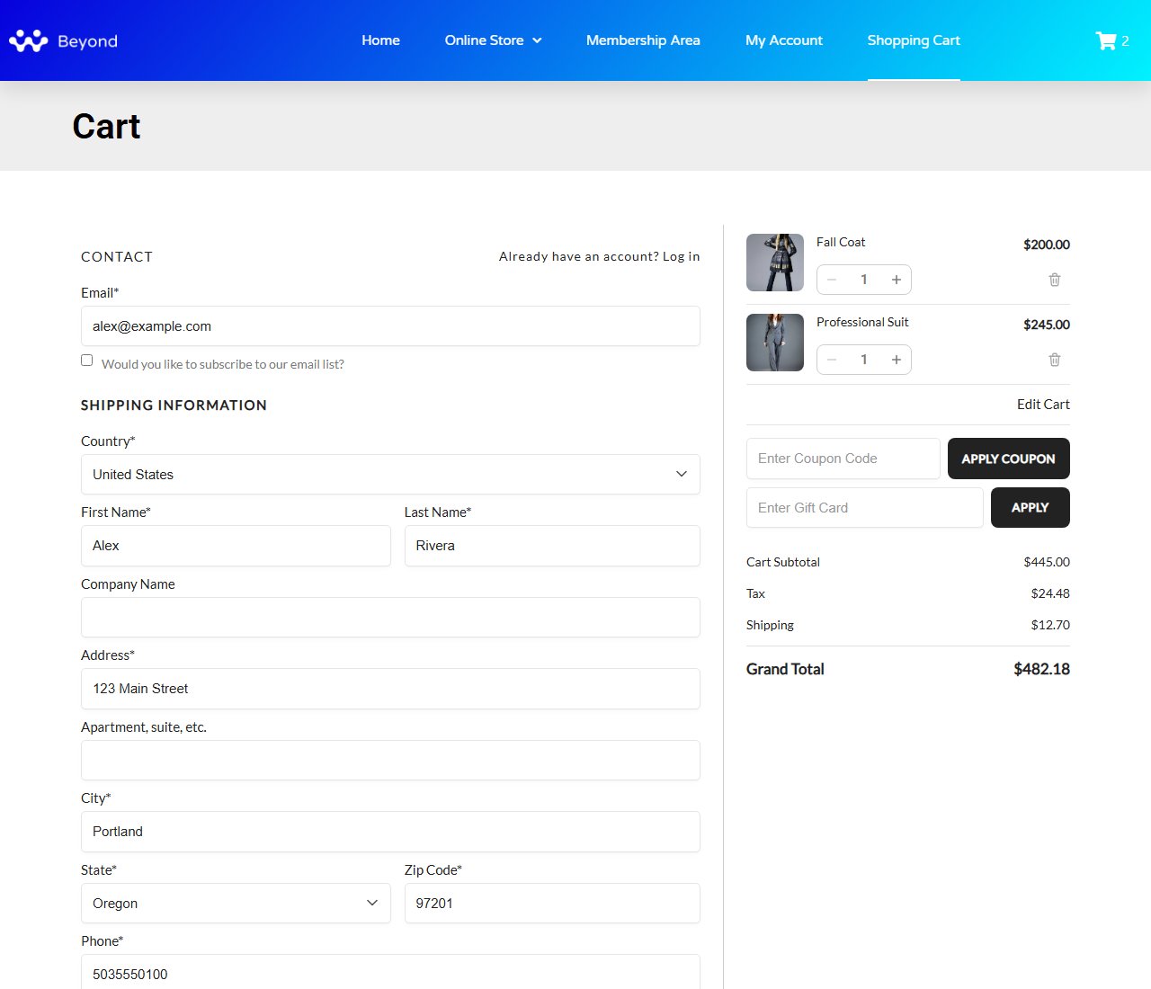
What shoppers get. The whole checkout on your cart page, with no reloads: contact, address, shipping method and payment on the left, and the order summary on the right, where it stays in view as they scroll on a wide screen. You choose one long page or steps, the cart first or straight into checkout, and whether shoppers can change their items in the summary.
The steps: choose the checkout flow, turn the one-page checkout on, add express buttons if you take wallets, then test it. The last part of this guide walks through what shoppers see, piece by piece.
Step 1. Choose how shoppers check out
Settings › Checkout › Checkout flow
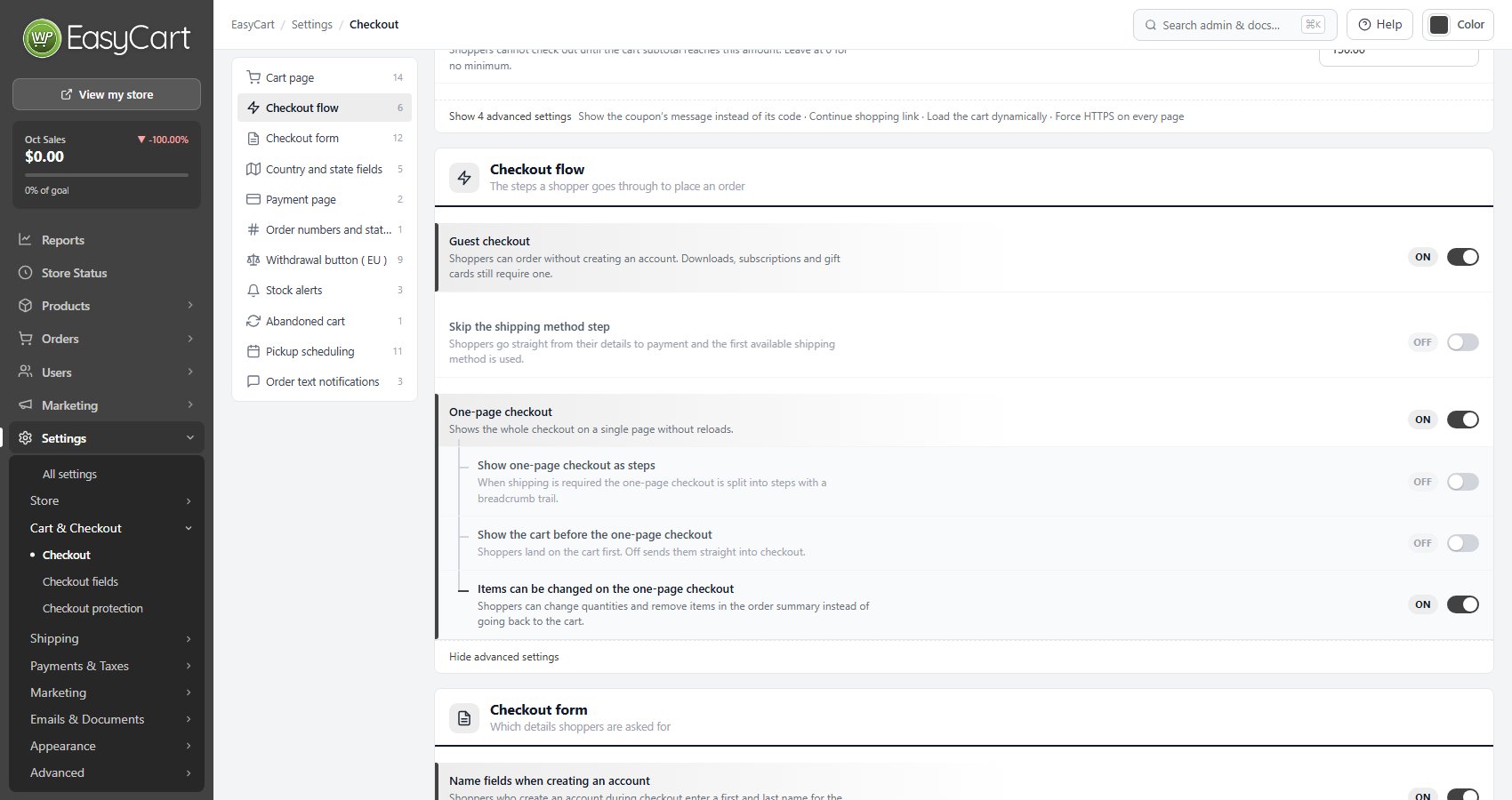
Open EasyCart › Settings › Checkout and find the Checkout flow card. Two switches shape every checkout, free or PRO.
Guest checkout: shoppers can order without creating an account. Leave it on. Downloads, subscriptions and gift cards still require an account.
Skip the shipping method step (advanced): shoppers go straight from their details to payment and the first available shipping method is used. Use it only when you offer one shipping option.
With Guest checkout off, or with a download in the cart, a shopper who is not signed in creates an account right on the checkout page. See Signing in and creating an account, below.
Step 2. Turn on the one-page checkout
Four switches, all PRO
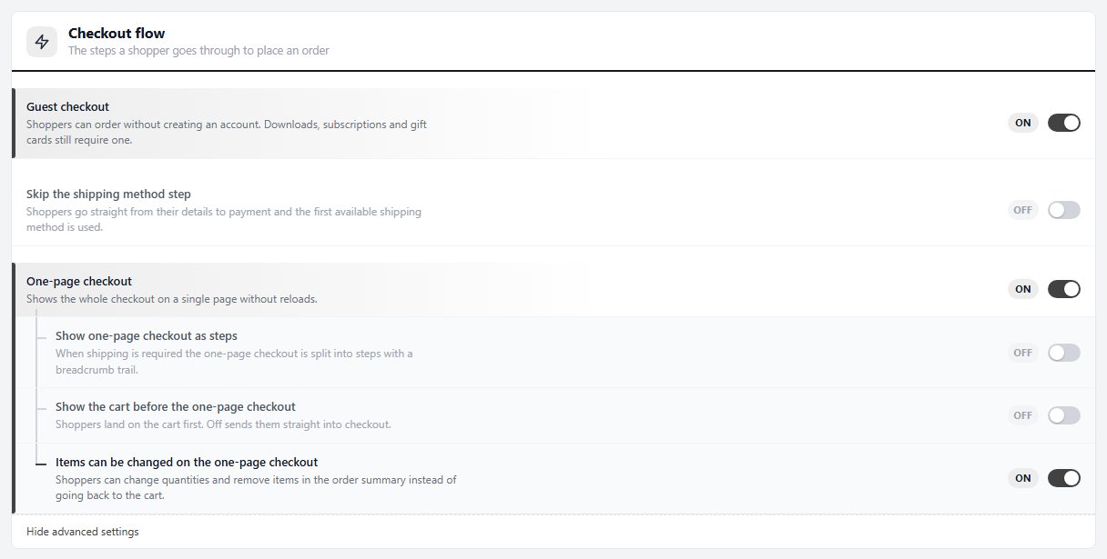
The one-page switches are advanced, so press the Show advanced settings link at the foot of the card (it says how many it reveals). Switches save as you change them.
One-page checkout: the whole checkout on a single page without reloads.
Show one-page checkout as steps: when the order ships, the page is split into steps under a breadcrumb trail: Cart, Information, Shipping and Payment. Leave it off for one page.
Show the cart before the one-page checkout: the cart page opens on the cart, and its Checkout button starts checkout. Off takes shoppers straight into checkout, and the cart is one click away under Edit Cart.
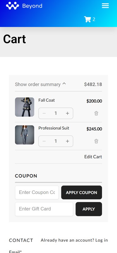
Items can be changed on the one-page checkout: each line of the order summary gets − and + buttons and a bin to remove it. Off, the summary shows each quantity on the product picture.
Step 3 (optional). Add express buttons
Apple Pay, Google Pay, Link and PayPal at the top of the checkout
When your gateway offers wallets, an Express checkout row with an OR divider sits at the very top, above Contact. A wallet shopper pays in a tap and never types an address. Every wallet option is PRO.
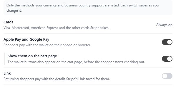
Stripe. In Settings › Payment press Manage on Stripe and open the Payment methods tab. Turn on Apple Pay and Google Pay and, under it, Show them on the cart page, which puts the buttons in the Express checkout row. Link lets returning Link shoppers pay with their saved details: a shopper who is not signed in gets Link’s email box in place of the email field. Press Save at the foot of the panel.
Square. In Square’s settings turn on Apple Pay, Google Pay and Microsoft Pay and fill in Merchant name, shown in the wallet sheet.
PayPal. With PayPal as your checkout button and PayPal on the cart page on, in its Buttons group, PayPal’s buttons join the Express checkout row while it shows. Shoppers who choose PayPal under Payment get its buttons there too.
The row stays hidden for a shopper who must create an account, for preorder and restaurant items, and, with PRO checkout fields, while a required question applies, unless that question has Ask after payment when skipped on. Stripe’s wallets also need an order of at least 50 cents in your currency.
What shoppers see: the cart
The cart screen of the one-page checkout
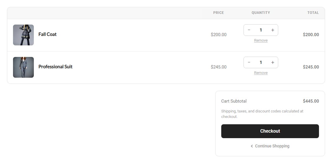
Shoppers see the cart first when Show the cart before the one-page checkout is on, and whenever they press Edit Cart (or Cart in the steps). Each item is a card with its picture, title and choices, − and + buttons around the quantity and a Remove link.
Under the items: the Cart Subtotal, a row for each offer with what it saves (PRO Offers), a Discounts row for other savings, and an Estimated total after them whenever a discount applies. A note says shipping, taxes and discount codes are calculated at checkout. The Checkout button uses your store’s main colour on every theme, with Continue Shopping as a link under it.
While the cart loads, shoppers see an outline of it with Loading your cart… above. After 8 seconds a line adds This is taking a little longer than usual.
What shoppers see: the order summary
Changing items without leaving the checkout
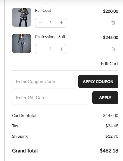
Each line shows the picture, the title, the choices and the line total. With Items can be changed on the one-page checkout on, a row under it holds a − / + stepper and a bin. With it off, a quantity above one sits as a badge on the picture.
A change saves on its own and the subtotal and every shipping price update straight away. A free gift from an offer has no controls, and bundle lines, grid quantities and Deconetwork lines have only the bin. Removing the last item takes the shopper to the empty cart. Removing the only download, or the last item that ships, redraws the checkout without the account or shipping part it no longer needs.
Below the lines sit Edit Cart (on the single page), the coupon and gift card boxes and the totals.
What shoppers see: why a quantity stops
A message at the item
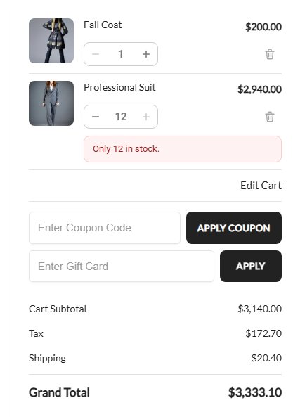
When a quantity cannot go higher or lower, a message under the item says why, on the cart page, the one-page cart and the order summary:
Only [stock] in stock. Where the product counts its stock as a whole, the same item with other choices already in the cart counts too: Only [stock] in stock, including [other] elsewhere in your cart. With stock hidden from shoppers it reads That’s all we have in stock.
You can buy up to [max] of this item. The product’s purchase limit.
The minimum for this item is [min]. Its minimum quantity.
Shoppers see the numbers, not the brackets. Change the wording in Settings › Language, under the cart phrases.
What shoppers see: on a phone
The summary folds into a bar
On a phone the order summary sits above the checkout as a Show order summary bar with the order total. A tap opens the same lines, with the − / + buttons and bin when items can be changed, and Edit Cart. Fields use a 16px size, so phones do not zoom in while shoppers type.
Ready to run your store on WP EasyCart?
Everything in this guide works with the free plugin. PRO and Premium add subscriptions, memberships, wholesale pricing and more. Try every PRO feature free for 14 days.