Designing your EasyCart system is a very simple process to do basic, intermediate, and advanced changes.
Basic design changes can be done via our admin sidebars. Adjusting button colors, changing number of columns to display products, switching basic layout designs, and other rollover effects are all adjusted via a simple sidebar.
Intermediate design changes might include custom CSS to adjust an EasyCart element and can easily be added to our custom CSS panel.
Advanced design changes would include custom layout and style files that use EasyCart child systems in order to maintain changes during plugin updates.
Customizing
Change basic design with Fonts, Colors, and custom CSS easily with WP EasyCart.
BASIC DESIGN CHANGES WITH SIDEBARS
Store Admin Sidebar
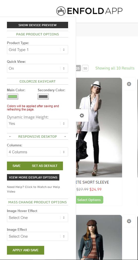
The store admin sidebar gives quick access to many design changes to make your products look great in nearly any theme. Simply login to your WordPress admin area, then visit your store page. You should see a white gear icon on the left hand side of the page that lets you open the live editor.

Product Type: Choose from several layouts that we offer to design your product layout grid. These prebuilt designs can be customized with CSS, but offer a nice quick way to find a look that fits your needs.
QuickView: If enabled, customers see a rollover button that allows you to ‘QuickView’ overlay a product without leaving the product page they are on.
Main Color/Secondary Color: These 2 colors will let you adjust all of the buttons throughout easycart quickly in one location. The secondary color often represents the rollover color. You must refresh your browser after you save these settings to see them in place.
Dynamic Image Height: This will automatically adjust the height of the image view to the height of your images being used. IF you have product images of similar size, this can be a great option. It may look odd if you have different height product images as the they will all adjust differently based on the height of the image and can produce a layout that doesn’t look quite as even. In this case, you can specify image heights that you would like to use in manual mode.
Columns: You can adjust how many columns you would like to appear on the page for product grid layouts. Choose between 1, 2, 3, 4, or 5 column layouts depending on what fits best in your themes content area.
Set as Default: This is a good setting once you have a set style you like. This will make all concurrent categories or pages you create with products to appear the same as this design. This setting can also affect your featured product layout within a product.
Image Hover Effect: Set what style of hover effect you want when a user scrolls over a product. Some crossfade and other flipbook effects require more than one image for the product, while others such as lighten and darken only require one single image on a product.
Image Effect: Adjust what effect on the product image you would like to see.
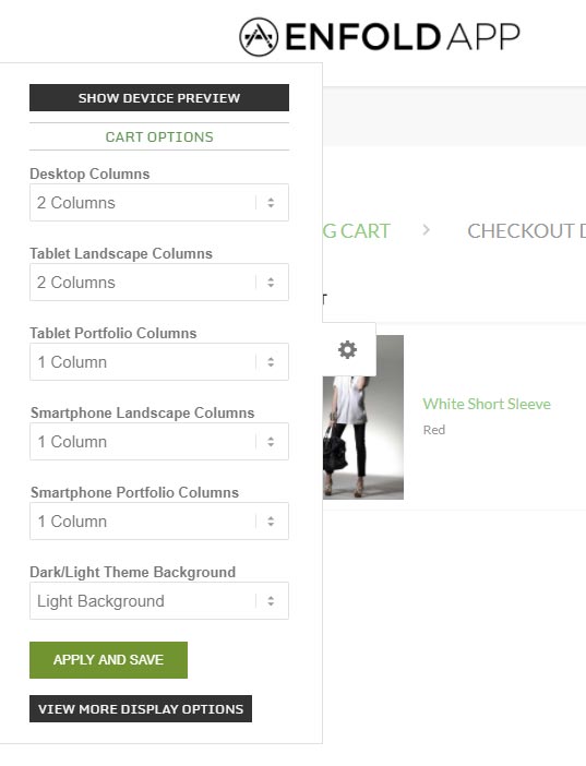
Cart Side Sidebar
With not as many options as the product sidebar, the admin sidebar in the cart area does allow you to adjust columns. While we recommend a full-width no-sidebar design in the cart and account pages, you can offer a single column layout to make this look better in many themes. A 2 column layout is preferred in most situations.

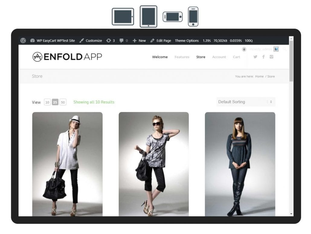
Device Preview
The device preview is available on top of the admin sidebars and lets you preview the pages in hypothetical tablet and phone system. These previews give you a good idea of what columns might look like in these different display layouts.

